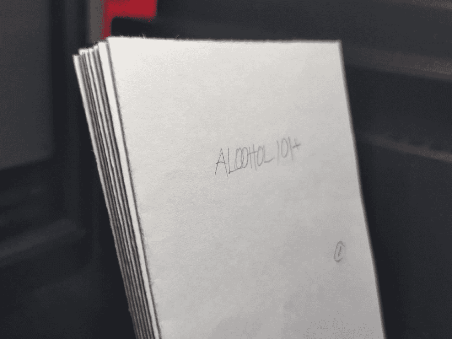
Alcohol 101+
2022
Designing a publication that compiles information all about one thing, the one thing I’ve selected is alcohol.
Alcohol 101+
2022
Designing a publication that compiles information all about one thing, the one thing I’ve selected is alcohol.
Mindmap
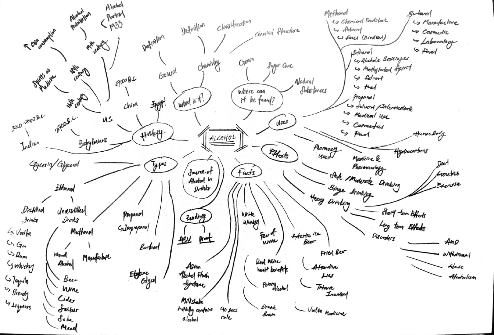
Although I’m not a “drinking person”, I would like to know more about alcohol, especially in alcoholic beverages as I’m not often drink alcoholic beverages unless gathering with friends, dinner with family on special day or during festival such as celebrating Lunar Chinese New Year and Christmas. I think it might be a potential thing to explore on—especially for a person who does not often consume alcoholic beverages frequently. I initially made a mind-map to gain some insight into all the perspectives I could explore on the subject, then organised the topics as my table of content and then start the research process.
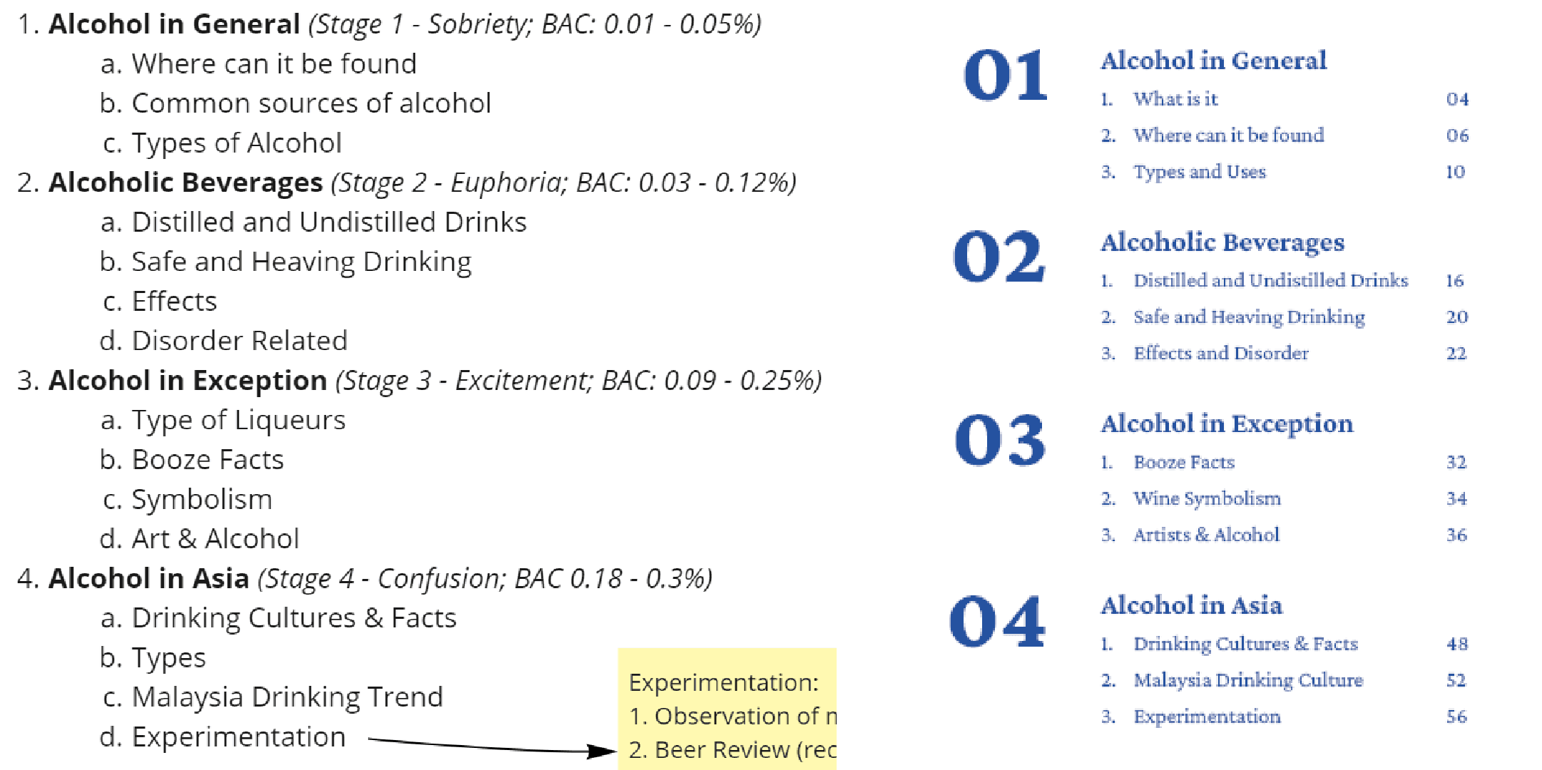
Secondary Research - Research List
1. What is Alcohol
2. Alcohol in Chemistry
3. Classification of Alcohol
4. Type of Alcohol
5. Uses of Alcohol
6. Where alcohol can be found
7. Common sources of alcohol
8. The History of Alcohol
9. Distilled and Undistilled Drinks
10. Beer — Lager and Ales
11. Wine — Tannin, Acidity, Sweet and Dry
12. Types of Wine
13. Cocktail Bitters and Alcopops
14. Type of Liqueurs
15. Safe and Heavy Drinking
16. Moderate and Binge Drinking
17. Side Effects of Alcohol
18. Drunk Stages
19. Disorder Related
20. 175 Alcohol Booze Facts
21. Artist and Alcohol
22. Beer Symbolism
23. Wine Symbolism
24. The Gods of Alcohol
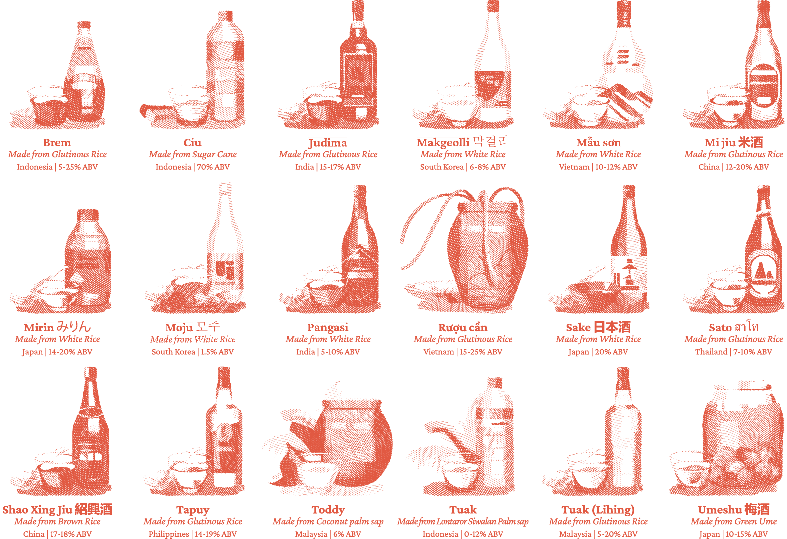
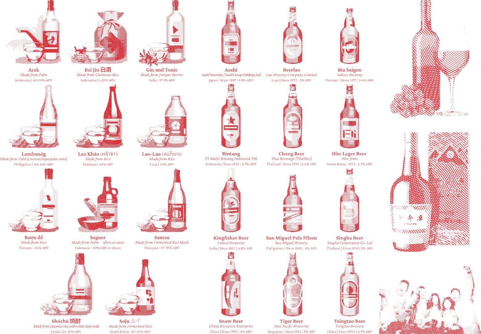
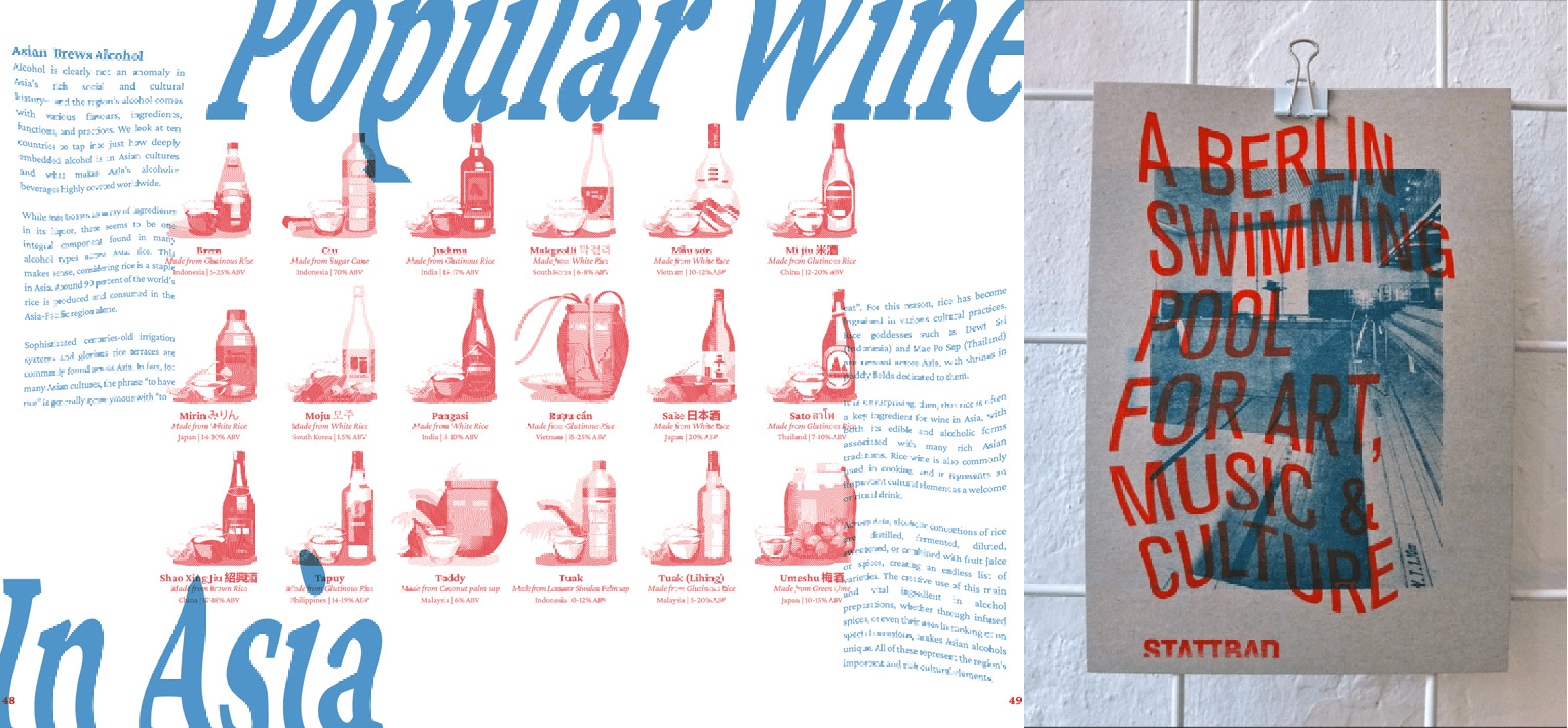
25. Alcohol Consumption in Asia
26. Asia Brew Alcohol
Primary Research : Observation
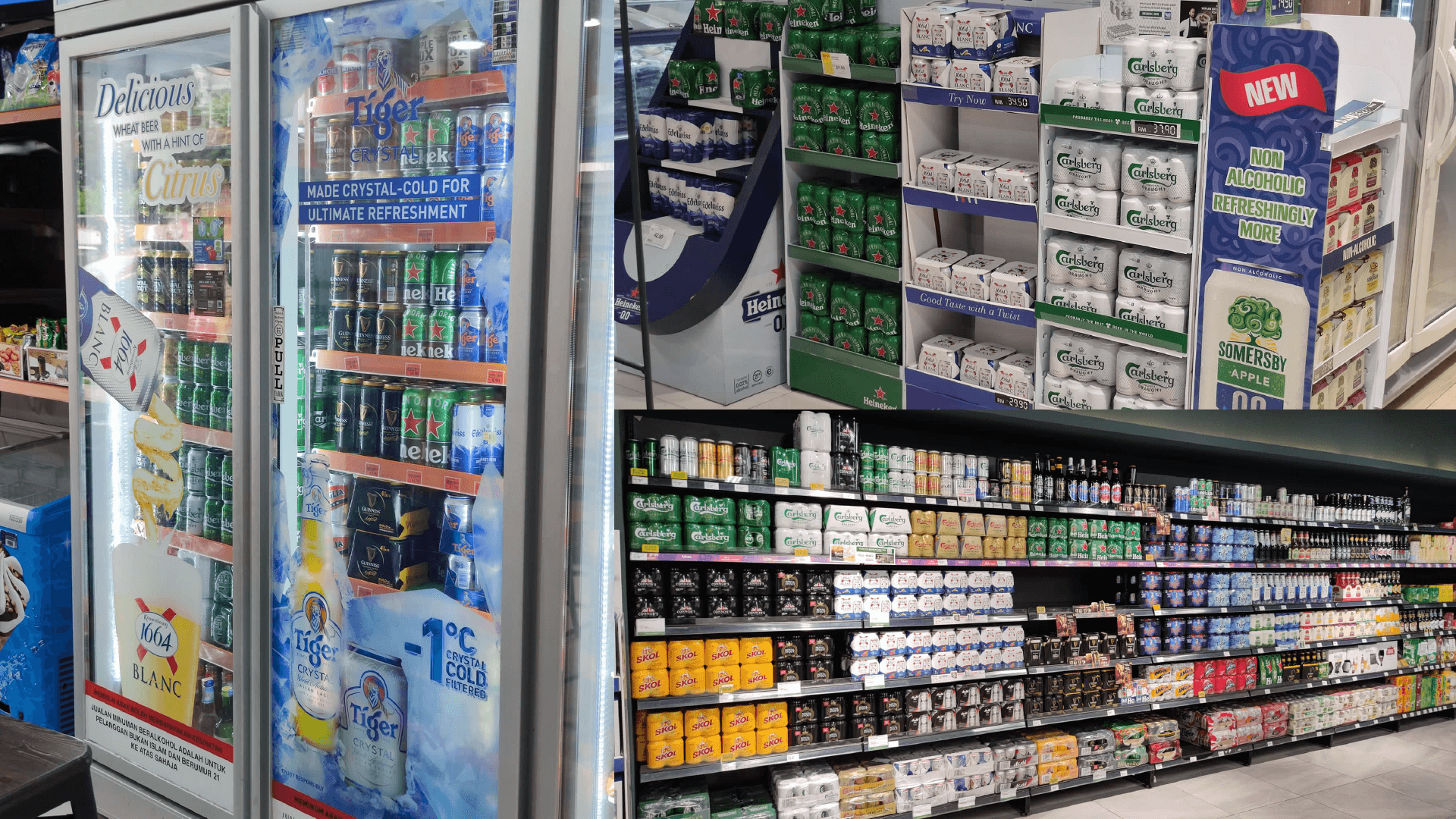
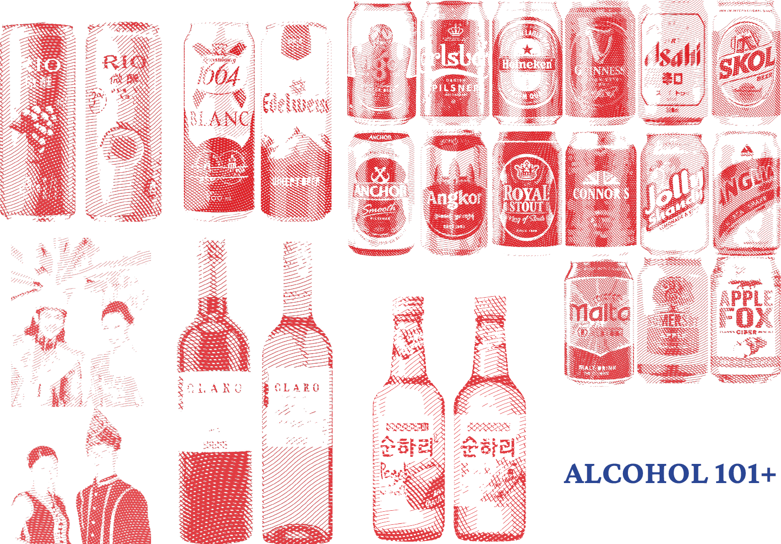
To know more about the current beer brands selling in Malaysia, I went to the following supermarkets and speedmarts to observe about it. The left image was shot in KK Mart, Bandar Sunway; the top right image was shot in AEON MaxValu Prime, Sunway Velocity mall; the bottom right image was shot in Village Grocer, MyTown. From these observation, I was able to list out the current selling beer brands in Malaysia, which are Tiger, Carlsberg, Heineken, Guinness, Asahi, Skol, Anchor, Angkor, Royal Stout, Connor’s, Jolly Shandy, Anglia, Edelweiss, and Krononbourg 1664 Blanc.
Primary Research : Drink Test
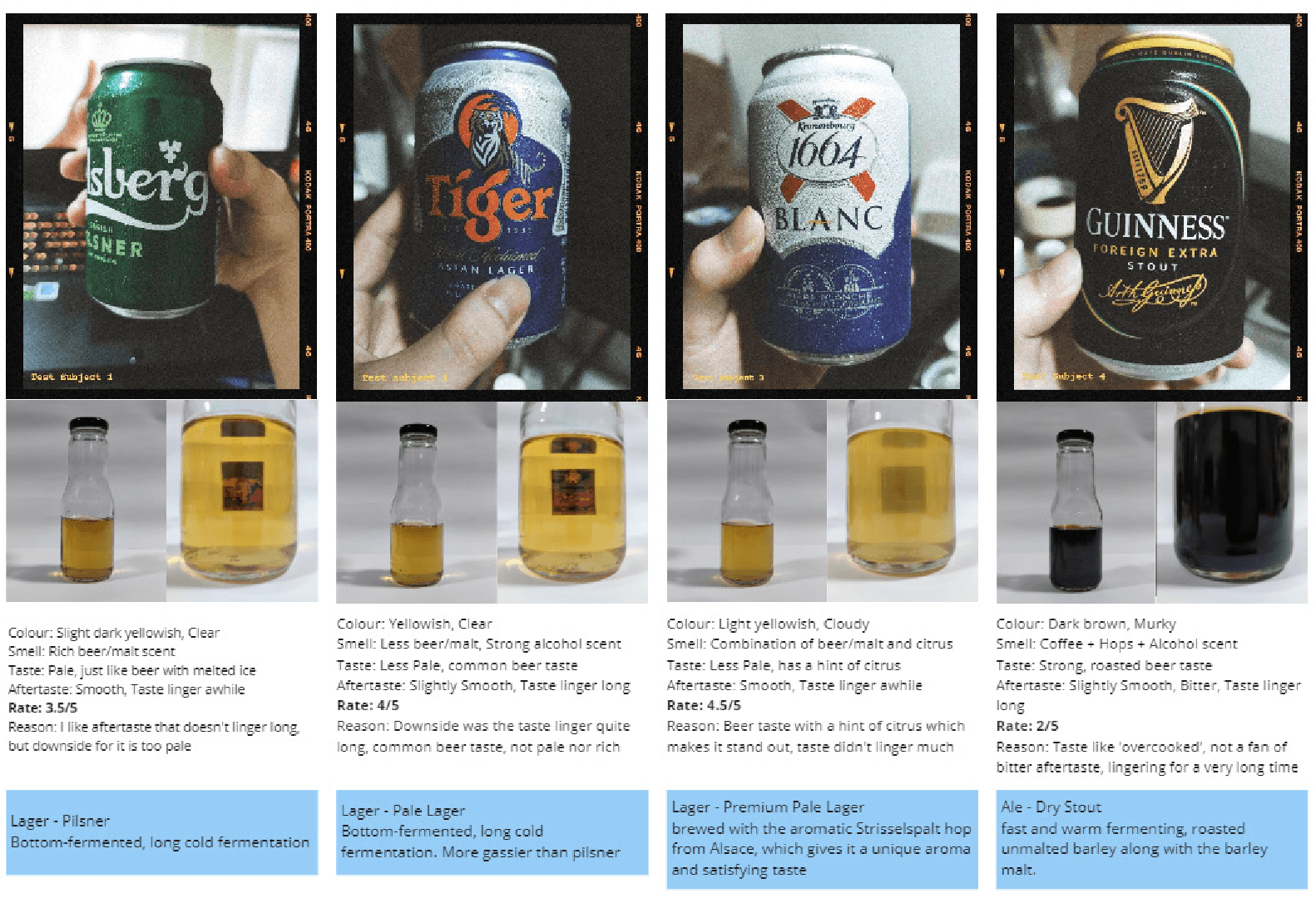
For this experiment, I randomly bought 15 alcholic beverages and 1 non-alcoholic beverage to test it out. During the process, I record the taste, aftertaste, murkiness, my ratings based on it and the description of my ratings. The 16 alcoholic beverages are TIger, Carlsberg, Asahi, Malta (non-alcoholic beverage), Guinness, Royal Stout, Edelweiss, Kronenbourg 1664 Blanc, Somersby, Apple Fox, Merlot (Red Wine), Sauvignon Blanc (White Wine), Soju Blackcurrant & Peach flavor, and Rio Light (Brandy Cocktail) Grape & Peach flavor.
Primary Research : Art Medium
In this experiment, I use the alcoholic beverages that I’ve purchased for the taste test, save some of it and use it as an art medium. Draw something using it and see the effect on paper and will it fade after a long time?
After having fun tasted it on art paper while having a few sips, the light coloured alcoholic beverages doesn’t leave a prominent stain on the paper even after a few layers. It will just leave a slightly yellowish stain on paper. However, for dark coloured alcoholic beverages such as Guinness and Royal Stout, it did leave a very prominent brown colour on the paper. Besides, the artwork has been placed 8 weeks for now and it doesn’t seem to be faded yet.
Book Ideation
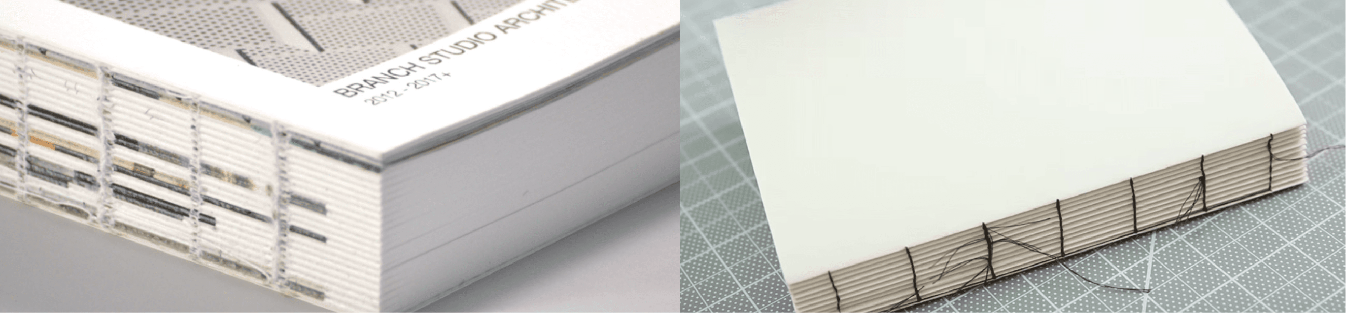
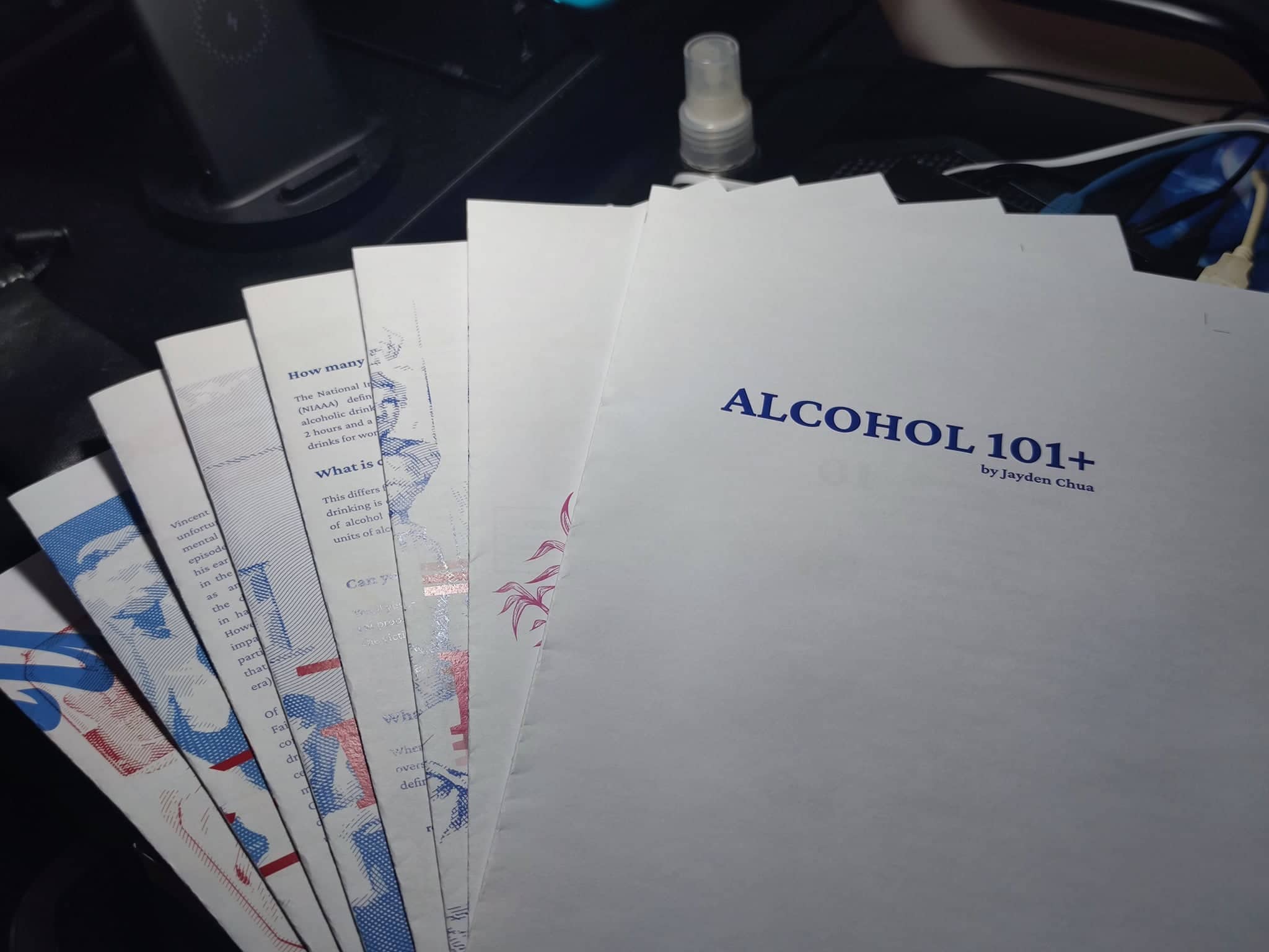
The book size was set as an B5 size (250 x 175mm). The binding style of the book is using DIY Kettle Stitch Binding. The reason for chosing this stitching method is to portray the experimental idea and present it as a documentation catalog. Other than that, it is a great opportunity for me to get it hands on for the binding process. The intention of the book is experimental, enjoying the process to compile any findings and experiments into a book and using it to create a discource—express all about alcohol and my idea of it.
Moodboard
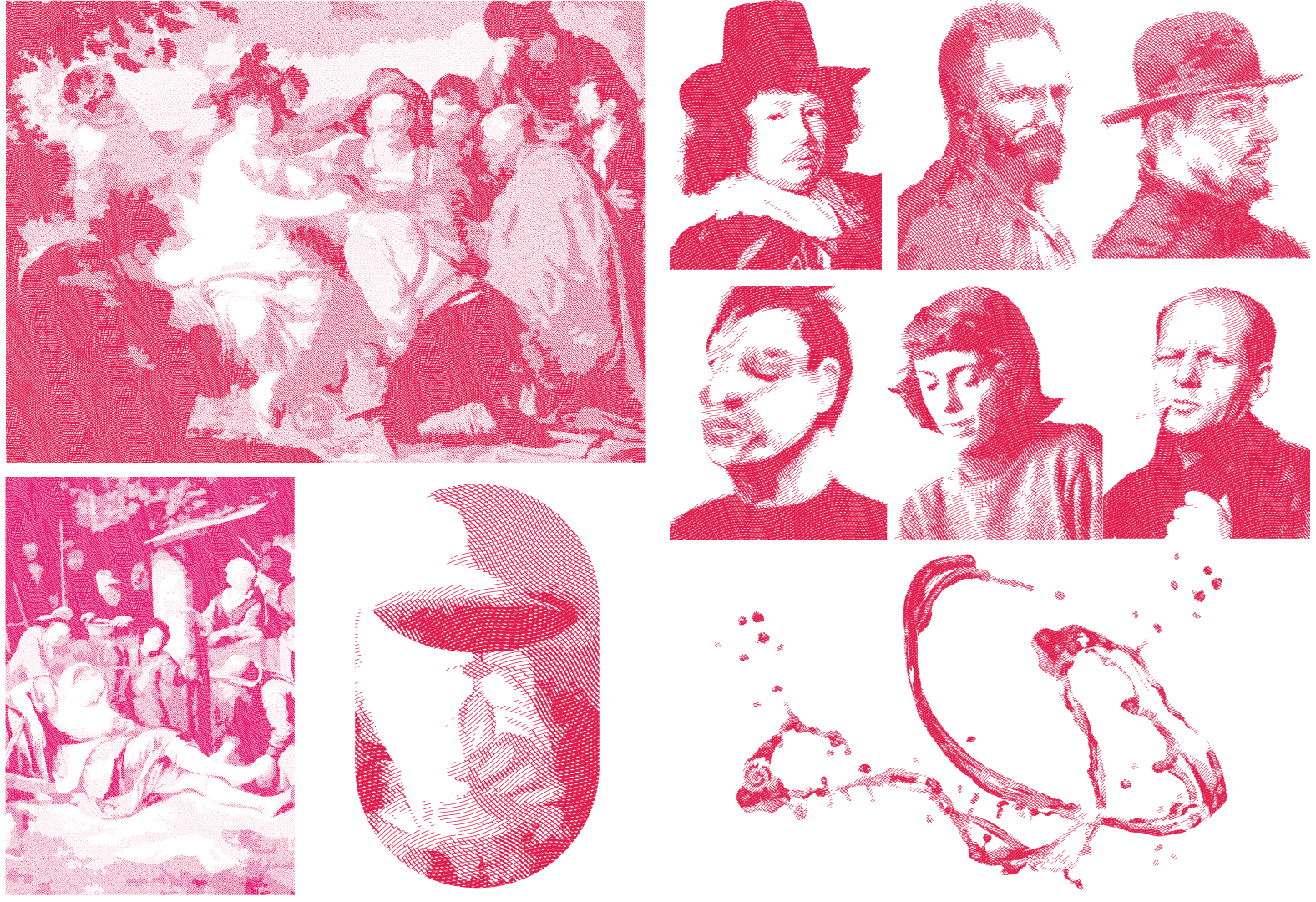
Based on the theme moodboard, the design concept of my book will apply duo-tone colour, vintage cross hatch imagery and contemporary brutalism approach. For visualising idea using colours and grid system, as my design concept is using duo-tone, the two colours portray the balance of self-consciousness and intoxication level. Each chapter will show the stages of drunkenness, starting from sobriety, euphoria, excitement to confusion. The indication of intoxication will slowly occur and increases as the pages go on. The balance of both colours will eventually be in a state of chaos to portray the loss of self-consciousness of being drunk.
Book Content Arrangement
The first attempt (Left) of arranging the book content based on the research findings and matching with the stages of drunkenness; the last attempt (Right) of arranging the book content based the page distribution for binding and content rearrangement from the first attempt. Most of the subtopic from the first attempt combine together in this version.
Layout Moodboard
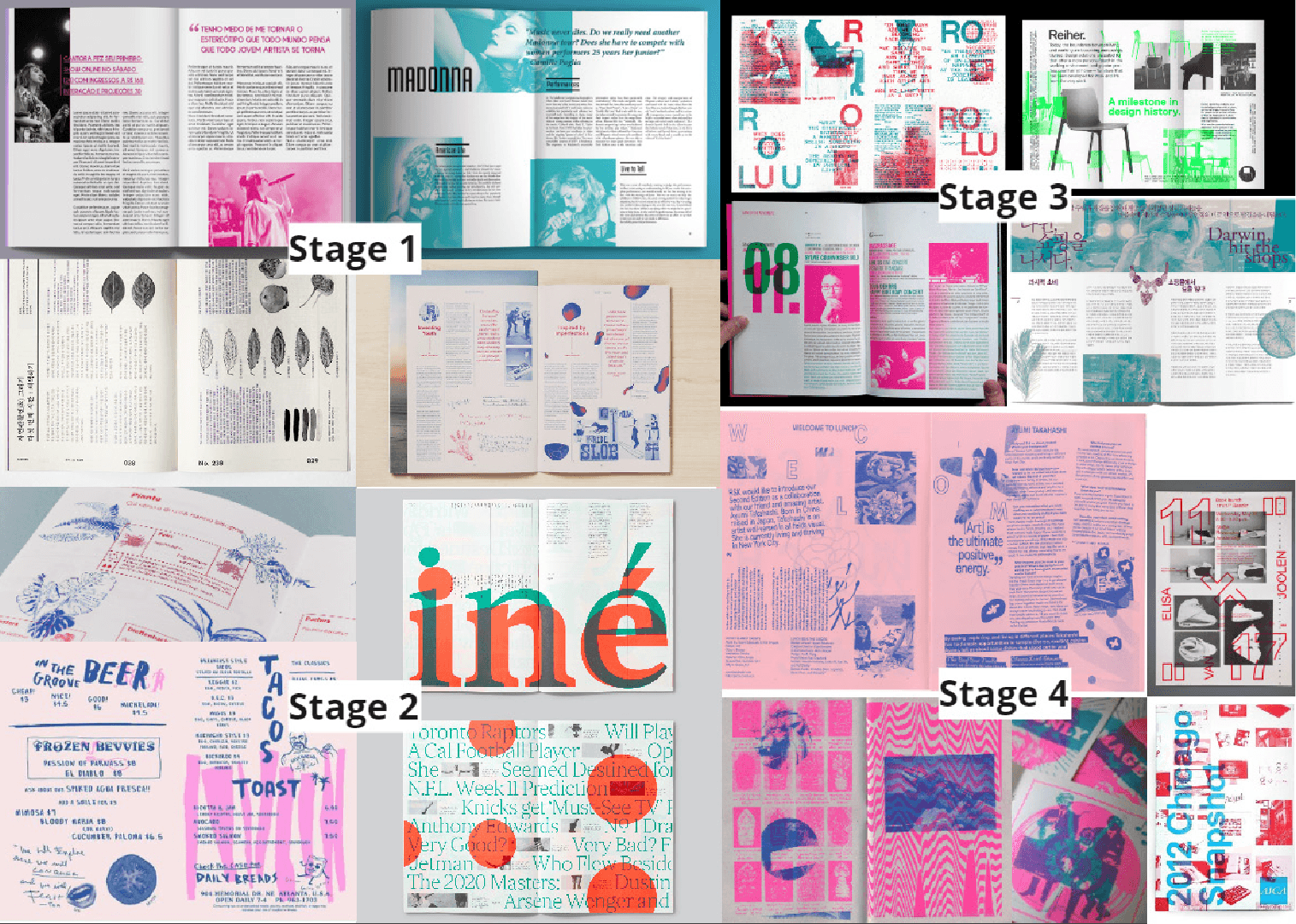
This moodboard is show to ideation of the layout of each chapter as I’ve adapted the ideation of the stages of drunkenness for each chapter.
Page Planning
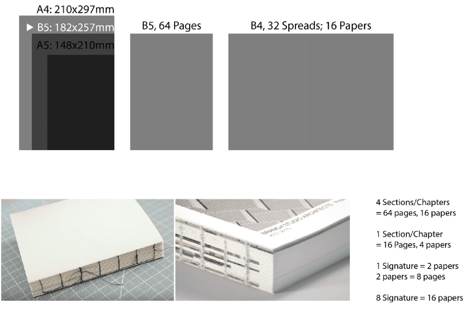
To ensure I’m able to achieve the binding method that I’ve planned for, I need to plan my pages to be a number that can be divided by 4. I planned my book will have 64 pages including the front and back cover, which means that it will be 32 spreads; 16 papers will be used in my book production.
On the other hand, I also need to plan about separate the spread into signature. This step is important which it will be easy for me to binding it altogether without having any miscommunication when I send it to printing. For the signature, as I’ve 16 papers used for my book production, I planned to have 8 signatures as each signature will have 2 papers folded.
Prototype
The prototype I’ve create using 4 pieces of A4 paper cut equally into 16 small spreads and divided in to 8 signatures which contains 2 small spreads and folded together. This step is to show outcome of the book and the paging arrangements.
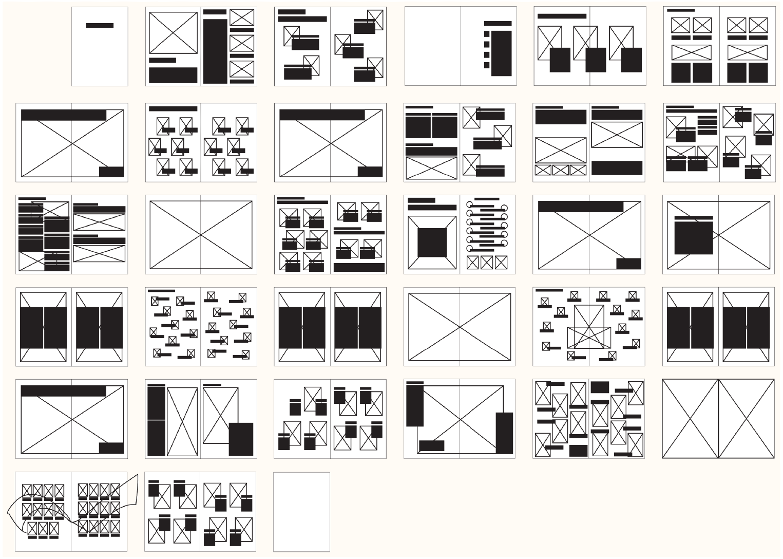
Layout Thumbnail
Typeface Selection
To make it more of a documentation and catalog type of approach, I decided to use serif fonts to as the typeface of the book. I initially decided around these three typefaces, Times New Roman, Cambria and Crimson Pro, and later decided to use Crimson Pro as the typeface. This is because the typeface is less formal and sharpness compared to the other two. As I’ve included the drunkenness stages concept to the book, using this typeface will convey the message or content more casual rather than formal.
Colour Concept
These are the colours used in the book. The pink colour indicates the level of intoxication, from pink (low intoxication) to saturated red (high intoxication); blue colour indicates the level of consciousness, from dark blue (high consciousness) to pale blue (low consciousness). Each chapter will only apply one of the pairing to indicate the drunkenness throughout the book.
Graphic Elements
Page Layout Ideas
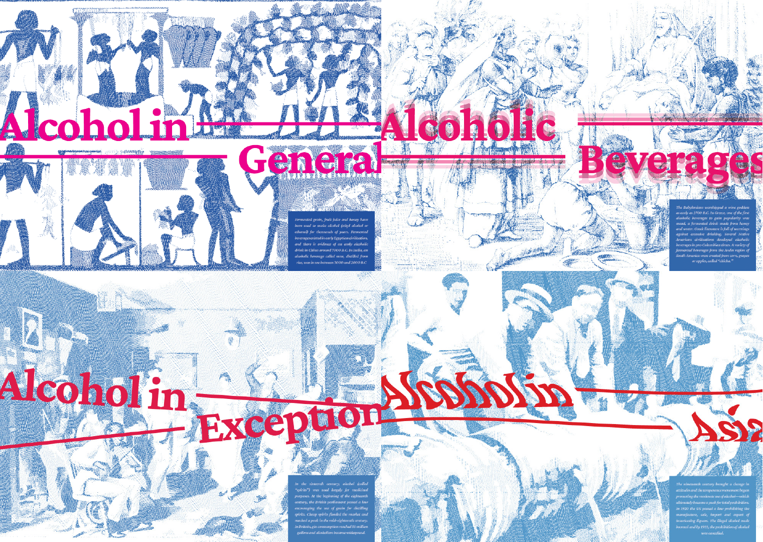
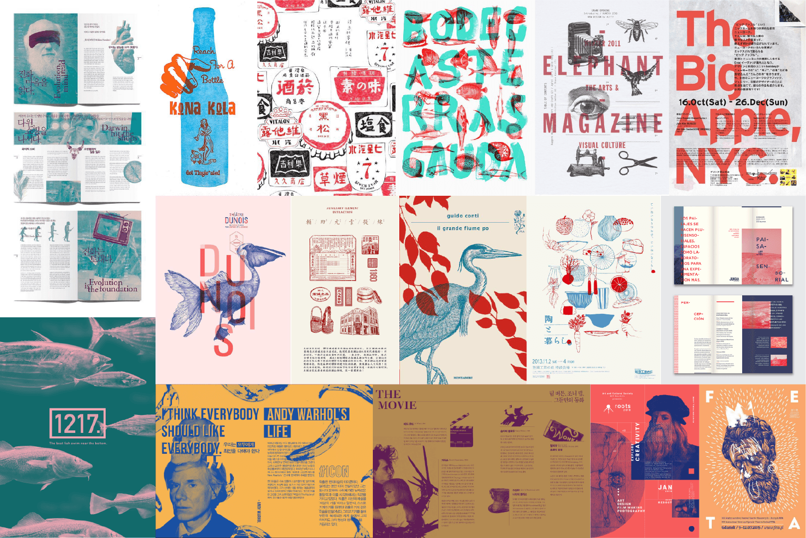
Each breakdown page of the 4 chapters included a brief history of alcohol in a different timeline and the background imagery shows the scene of that particular history. Besides, the typography indicates the effect of intoxication, as the image shown, the first image (top left) has nothing happen to the text compared to the last image (bottom right) which the text has altered to portray the point of view of drunk.
In Chapter 1, the grid and imagery all follows according to the grid system, indication the early stage of drunkenness—Sobriety. The stage where consists low level on intoxicated and still remain clear consciousness. This spread layout is reference from Dari Ngak Ngik Ngok ke Dheg Dheg Plas by Irama Nusantara (Right).
In Chapter 2, the text and imagery starting to blend together, not fully according to the grid system, indication of the second stage of drunkenness—Euphoria. The stage where the intoxication staring to take place while still able to remain consciousness. This spread layout is reference from Housatonic Guidebook 2019 by 17 artists.
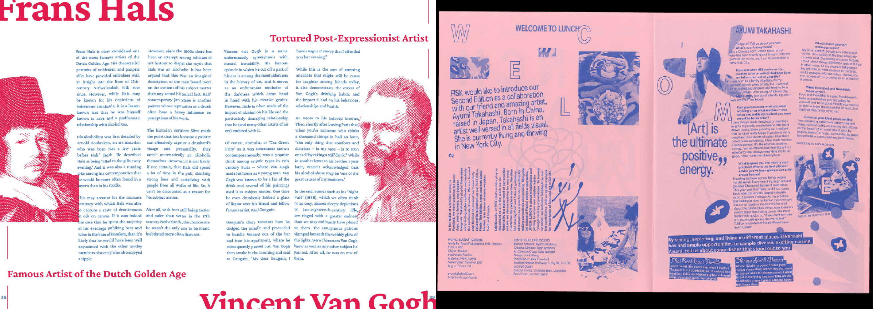
In this chapter, the text starting to have its own thought, slightly slanted to different directions, the saturation from the early pink colour has started to turn red. Indication of the third stage of drunkenness — Excitement. The stage where the intoxication increases while bearly remain consciousness. This spread layout is reference from LUNCH by Junki Hong.
In this chapter, the text diffuse into multiple directions, portraying the drunk vision, the pink colour from the early stages has turned into saturated red, indication of the fourth stage of drunkenness — Confusion. The stage where the intoxication level reached it peaks and heavily effecting the consciousness as a result of unconsciousnness or temporary lost some function of senses and remembering. This spread layout is reference to DSCF4775 by Anna Niestroj.
Test Print
Test prints is to ensure the text sizin, layout measurement and colours are done in the ideal way as expected.
Binding Process
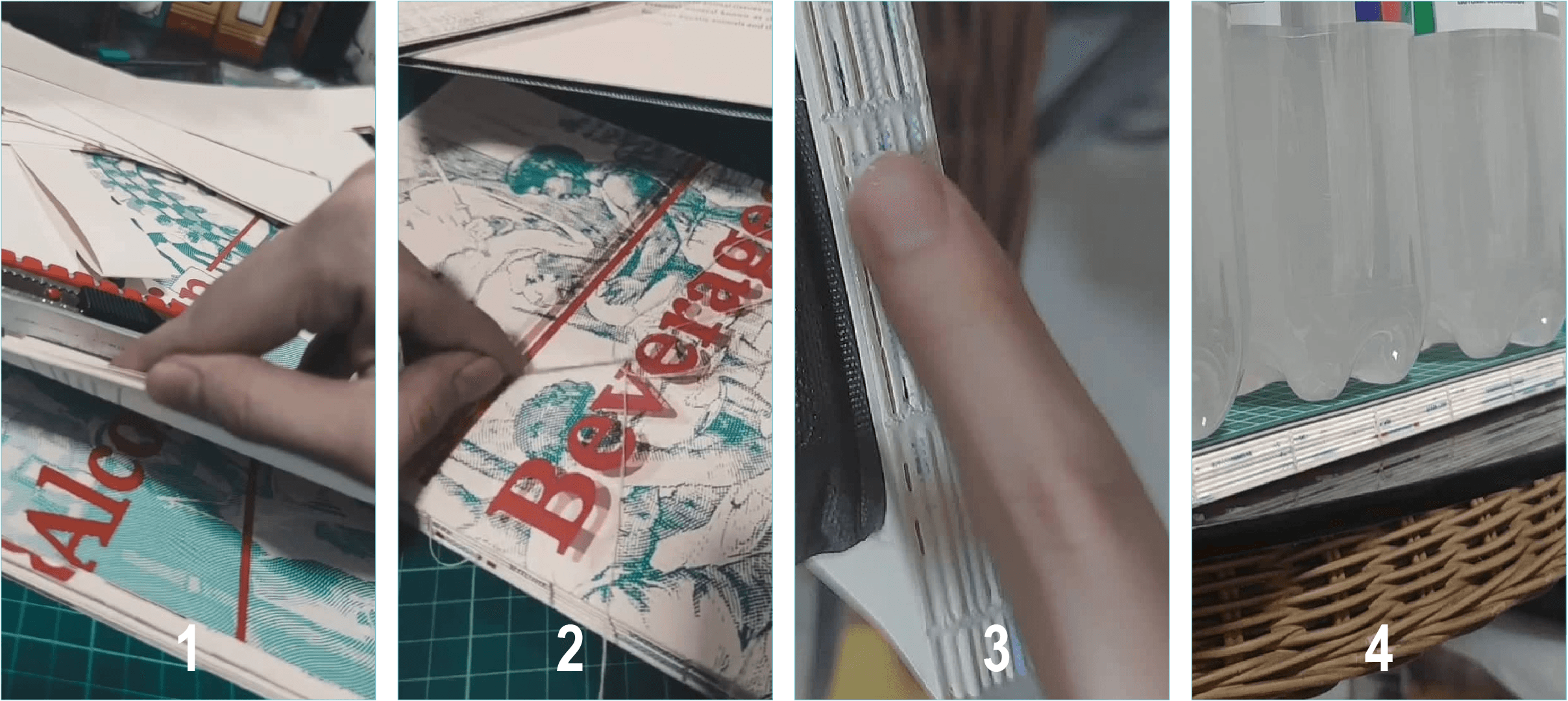
1. Trim and Fold
Trim the papers according to the crop mark and fold it half for each spread and arrange it accordingly.
2. Measure and Punch Hole
Measure and punch a few holes at the middle of the papers and sew/bind it all together to create the spine of the book.
3. Apply Adhesive Finishing
After sewing, apply PVA glue to the spine to provide extra support for the spine, it can hold the book together and as a finishing layer.
4. Compress and Dry Out
Apply extra forces to prevent the adhesive leak into the pages, left it few hours till it fully dries out. And the book binding is done.
Mindmap
Although I’m not a “drinking person”, I would like to know more about alcohol, especially in alcoholic beverages as I’m not often drink alcoholic beverages unless gathering with friends, dinner with family on special day or during festival such as celebrating Lunar Chinese New Year and Christmas. I think it might be a potential thing to explore on—especially for a person who does not often consume alcoholic beverages frequently. I initially made a mind-map to gain some insight into all the perspectives I could explore on the subject, then organised the topics as my table of content and then start the research process.
Secondary Research - Research List
1. What is Alcohol
2. Alcohol in Chemistry
3. Classification of Alcohol
4. Type of Alcohol
5. Uses of Alcohol
6. Where alcohol can be found
7. Common sources of alcohol
8. The History of Alcohol
9. Distilled and Undistilled Drinks
10. Beer — Lager and Ales
11. Wine — Tannin, Acidity, Sweet and Dry
12. Types of Wine
13. Cocktail Bitters and Alcopops
14. Type of Liqueurs
15. Safe and Heavy Drinking
16. Moderate and Binge Drinking
17. Side Effects of Alcohol
18. Drunk Stages
19. Disorder Related
20. 175 Alcohol Booze Facts
21. Artist and Alcohol
22. Beer Symbolism
23. Wine Symbolism
24. The Gods of Alcohol
25. Alcohol Consumption in Asia
26. Asia Brew Alcohol
Primary Research : Observation
To know more about the current beer brands selling in Malaysia, I went to the following supermarkets and speedmarts to observe about it. The left image was shot in KK Mart, Bandar Sunway; the top right image was shot in AEON MaxValu Prime, Sunway Velocity mall; the bottom right image was shot in Village Grocer, MyTown. From these observation, I was able to list out the current selling beer brands in Malaysia, which are Tiger, Carlsberg, Heineken, Guinness, Asahi, Skol, Anchor, Angkor, Royal Stout, Connor’s, Jolly Shandy, Anglia, Edelweiss, and Krononbourg 1664 Blanc.
Primary Research : Drink Test
For this experiment, I randomly bought 15 alcholic beverages and 1 non-alcoholic beverage to test it out. During the process, I record the taste, aftertaste, murkiness, my ratings based on it and the description of my ratings. The 16 alcoholic beverages are TIger, Carlsberg, Asahi, Malta (non-alcoholic beverage), Guinness, Royal Stout, Edelweiss, Kronenbourg 1664 Blanc, Somersby, Apple Fox, Merlot (Red Wine), Sauvignon Blanc (White Wine), Soju Blackcurrant & Peach flavor, and Rio Light (Brandy Cocktail) Grape & Peach flavor.
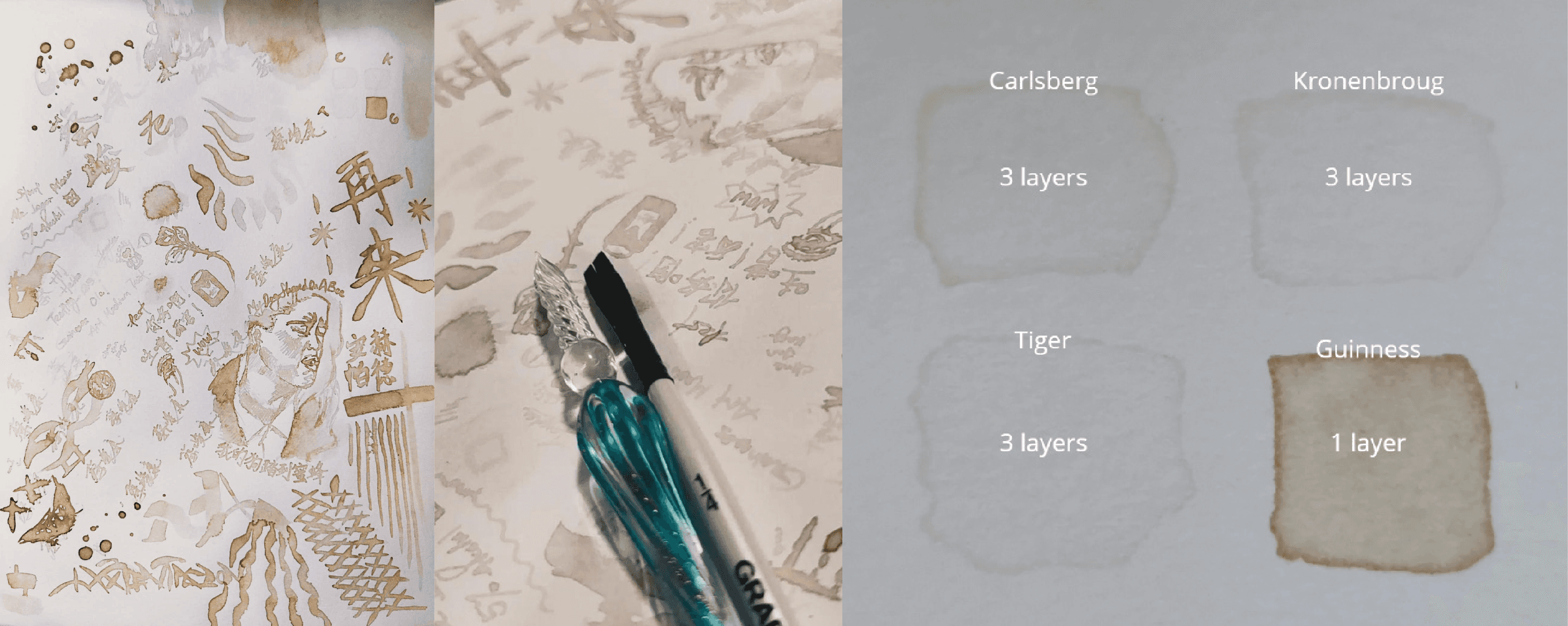
Primary Research : Art Medium
In this experiment, I use the alcoholic beverages that I’ve purchased for the taste test, save some of it and use it as an art medium. Draw something using it and see the effect on paper and will it fade after a long time?
After having fun tasted it on art paper while having a few sips, the light coloured alcoholic beverages doesn’t leave a prominent stain on the paper even after a few layers. It will just leave a slightly yellowish stain on paper. However, for dark coloured alcoholic beverages such as Guinness and Royal Stout, it did leave a very prominent brown colour on the paper. Besides, the artwork has been placed 8 weeks for now and it doesn’t seem to be faded yet.
Book Ideation
The book size was set as an B5 size (250 x 175mm). The binding style of the book is using DIY Kettle Stitch Binding. The reason for chosing this stitching method is to portray the experimental idea and present it as a documentation catalog. Other than that, it is a great opportunity for me to get it hands on for the binding process. The intention of the book is experimental, enjoying the process to compile any findings and experiments into a book and using it to create a discource—express all about alcohol and my idea of it.
Moodboard
Based on the theme moodboard, the design concept of my book will apply duo-tone colour, vintage cross hatch imagery and contemporary brutalism approach. For visualising idea using colours and grid system, as my design concept is using duo-tone, the two colours portray the balance of self-consciousness and intoxication level. Each chapter will show the stages of drunkenness, starting from sobriety, euphoria, excitement to confusion. The indication of intoxication will slowly occur and increases as the pages go on. The balance of both colours will eventually be in a state of chaos to portray the loss of self-consciousness of being drunk.
Book Content Arrangement
The first attempt (Left) of arranging the book content based on the research findings and matching with the stages of drunkenness; the last attempt (Right) of arranging the book content based the page distribution for binding and content rearrangement from the first attempt. Most of the subtopic from the first attempt combine together in this version.
Layout Moodboard
This moodboard is show to ideation of the layout of each chapter as I’ve adapted the ideation of the stages of drunkenness for each chapter.
Page Planning
To ensure I’m able to achieve the binding method that I’ve planned for, I need to plan my pages to be a number that can be divided by 4. I planned my book will have 64 pages including the front and back cover, which means that it will be 32 spreads; 16 papers will be used in my book production.
On the other hand, I also need to plan about separate the spread into signature. This step is important which it will be easy for me to binding it altogether without having any miscommunication when I send it to printing. For the signature, as I’ve 16 papers used for my book production, I planned to have 8 signatures as each signature will have 2 papers folded.
Prototype
The prototype I’ve create using 4 pieces of A4 paper cut equally into 16 small spreads and divided in to 8 signatures which contains 2 small spreads and folded together. This step is to show outcome of the book and the paging arrangements.
Layout Thumbnail
Typeface Selection
To make it more of a documentation and catalog type of approach, I decided to use serif fonts to as the typeface of the book. I initially decided around these three typefaces, Times New Roman, Cambria and Crimson Pro, and later decided to use Crimson Pro as the typeface. This is because the typeface is less formal and sharpness compared to the other two. As I’ve included the drunkenness stages concept to the book, using this typeface will convey the message or content more casual rather than formal.
Colour Concept
These are the colours used in the book. The pink colour indicates the level of intoxication, from pink (low intoxication) to saturated red (high intoxication); blue colour indicates the level of consciousness, from dark blue (high consciousness) to pale blue (low consciousness). Each chapter will only apply one of the pairing to indicate the drunkenness throughout the book.
Graphic Elements
Page Layout Ideas
Each breakdown page of the 4 chapters included a brief history of alcohol in a different timeline and the background imagery shows the scene of that particular history. Besides, the typography indicates the effect of intoxication, as the image shown, the first image (top left) has nothing happen to the text compared to the last image (bottom right) which the text has altered to portray the point of view of drunk.
In Chapter 1, the grid and imagery all follows according to the grid system, indication the early stage of drunkenness—Sobriety. The stage where consists low level on intoxicated and still remain clear consciousness. This spread layout is reference from Dari Ngak Ngik Ngok ke Dheg Dheg Plas by Irama Nusantara (Right).
In Chapter 2, the text and imagery starting to blend together, not fully according to the grid system, indication of the second stage of drunkenness—Euphoria. The stage where the intoxication staring to take place while still able to remain consciousness. This spread layout is reference from Housatonic Guidebook 2019 by 17 artists.
In this chapter, the text starting to have its own thought, slightly slanted to different directions, the saturation from the early pink colour has started to turn red. Indication of the third stage of drunkenness — Excitement. The stage where the intoxication increases while bearly remain consciousness. This spread layout is reference from LUNCH by Junki Hong.
In this chapter, the text diffuse into multiple directions, portraying the drunk vision, the pink colour from the early stages has turned into saturated red, indication of the fourth stage of drunkenness — Confusion. The stage where the intoxication level reached it peaks and heavily effecting the consciousness as a result of unconsciousnness or temporary lost some function of senses and remembering. This spread layout is reference to DSCF4775 by Anna Niestroj.
Test Print
Test prints is to ensure the text sizin, layout measurement and colours are done in the ideal way as expected.
Binding Process
1. Trim and Fold
Trim the papers according to the crop mark and fold it half for each spread and arrange it accordingly.
2. Measure and Punch Hole
Measure and punch a few holes at the middle of the papers and sew/bind it all together to create the spine of the book.
3. Apply Adhesive Finishing
After sewing, apply PVA glue to the spine to provide extra support for the spine, it can hold the book together and as a finishing layer.
4. Compress and Dry Out
Apply extra forces to prevent the adhesive leak into the pages, left it few hours till it fully dries out. And the book binding is done.
Mindmap
Although I’m not a “drinking person”, I would like to know more about alcohol, especially in alcoholic beverages as I’m not often drink alcoholic beverages unless gathering with friends, dinner with family on special day or during festival such as celebrating Lunar Chinese New Year and Christmas. I think it might be a potential thing to explore on—especially for a person who does not often consume alcoholic beverages frequently. I initially made a mind-map to gain some insight into all the perspectives I could explore on the subject, then organised the topics as my table of content and then start the research process.
Secondary Research - Research List
1. What is Alcohol
2. Alcohol in Chemistry
3. Classification of Alcohol
4. Type of Alcohol
5. Uses of Alcohol
6. Where alcohol can be found
7. Common sources of alcohol
8. The History of Alcohol
9. Distilled and Undistilled Drinks
10. Beer — Lager and Ales
11. Wine — Tannin, Acidity, Sweet and Dry
12. Types of Wine
13. Cocktail Bitters and Alcopops
14. Type of Liqueurs
15. Safe and Heavy Drinking
16. Moderate and Binge Drinking
17. Side Effects of Alcohol
18. Drunk Stages
19. Disorder Related
20. 175 Alcohol Booze Facts
21. Artist and Alcohol
22. Beer Symbolism
23. Wine Symbolism
24. The Gods of Alcohol
25. Alcohol Consumption in Asia
26. Asia Brew Alcohol
Primary Research : Observation
To know more about the current beer brands selling in Malaysia, I went to the following supermarkets and speedmarts to observe about it. The left image was shot in KK Mart, Bandar Sunway; the top right image was shot in AEON MaxValu Prime, Sunway Velocity mall; the bottom right image was shot in Village Grocer, MyTown. From these observation, I was able to list out the current selling beer brands in Malaysia, which are Tiger, Carlsberg, Heineken, Guinness, Asahi, Skol, Anchor, Angkor, Royal Stout, Connor’s, Jolly Shandy, Anglia, Edelweiss, and Krononbourg 1664 Blanc.
Primary Research : Drink Test
For this experiment, I randomly bought 15 alcholic beverages and 1 non-alcoholic beverage to test it out. During the process, I record the taste, aftertaste, murkiness, my ratings based on it and the description of my ratings. The 16 alcoholic beverages are TIger, Carlsberg, Asahi, Malta (non-alcoholic beverage), Guinness, Royal Stout, Edelweiss, Kronenbourg 1664 Blanc, Somersby, Apple Fox, Merlot (Red Wine), Sauvignon Blanc (White Wine), Soju Blackcurrant & Peach flavor, and Rio Light (Brandy Cocktail) Grape & Peach flavor.
Primary Research : Art Medium
In this experiment, I use the alcoholic beverages that I’ve purchased for the taste test, save some of it and use it as an art medium. Draw something using it and see the effect on paper and will it fade after a long time?
After having fun tasted it on art paper while having a few sips, the light coloured alcoholic beverages doesn’t leave a prominent stain on the paper even after a few layers. It will just leave a slightly yellowish stain on paper. However, for dark coloured alcoholic beverages such as Guinness and Royal Stout, it did leave a very prominent brown colour on the paper. Besides, the artwork has been placed 8 weeks for now and it doesn’t seem to be faded yet.
Book Ideation
The book size was set as an B5 size (250 x 175mm). The binding style of the book is using DIY Kettle Stitch Binding. The reason for chosing this stitching method is to portray the experimental idea and present it as a documentation catalog. Other than that, it is a great opportunity for me to get it hands on for the binding process. The intention of the book is experimental, enjoying the process to compile any findings and experiments into a book and using it to create a discource—express all about alcohol and my idea of it.
Moodboard
Based on the theme moodboard, the design concept of my book will apply duo-tone colour, vintage cross hatch imagery and contemporary brutalism approach. For visualising idea using colours and grid system, as my design concept is using duo-tone, the two colours portray the balance of self-consciousness and intoxication level. Each chapter will show the stages of drunkenness, starting from sobriety, euphoria, excitement to confusion. The indication of intoxication will slowly occur and increases as the pages go on. The balance of both colours will eventually be in a state of chaos to portray the loss of self-consciousness of being drunk.
Book Content Arrangement
The first attempt (Left) of arranging the book content based on the research findings and matching with the stages of drunkenness; the last attempt (Right) of arranging the book content based the page distribution for binding and content rearrangement from the first attempt. Most of the subtopic from the first attempt combine together in this version.
Layout Moodboard
This moodboard is show to ideation of the layout of each chapter as I’ve adapted the ideation of the stages of drunkenness for each chapter.
Page Planning
To ensure I’m able to achieve the binding method that I’ve planned for, I need to plan my pages to be a number that can be divided by 4. I planned my book will have 64 pages including the front and back cover, which means that it will be 32 spreads; 16 papers will be used in my book production.
On the other hand, I also need to plan about separate the spread into signature. This step is important which it will be easy for me to binding it altogether without having any miscommunication when I send it to printing. For the signature, as I’ve 16 papers used for my book production, I planned to have 8 signatures as each signature will have 2 papers folded.
Prototype
The prototype I’ve create using 4 pieces of A4 paper cut equally into 16 small spreads and divided in to 8 signatures which contains 2 small spreads and folded together. This step is to show outcome of the book and the paging arrangements.
Layout Thumbnail
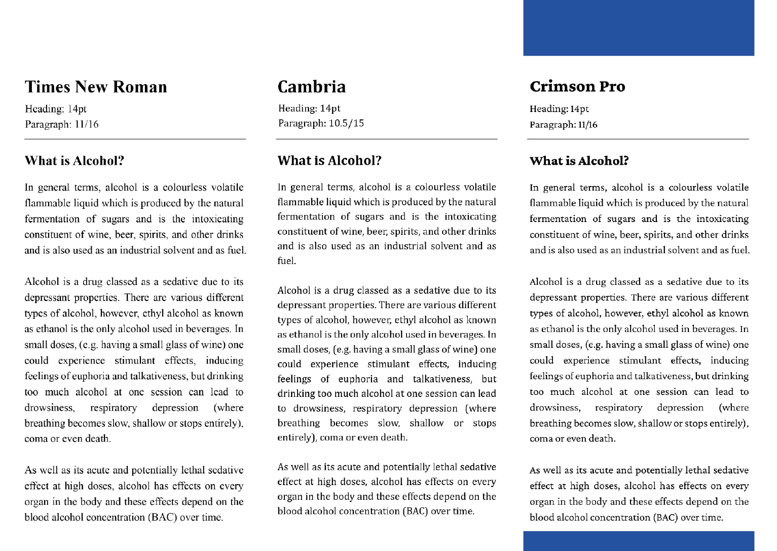
Typeface Selection
To make it more of a documentation and catalog type of approach, I decided to use serif fonts to as the typeface of the book. I initially decided around these three typefaces, Times New Roman, Cambria and Crimson Pro, and later decided to use Crimson Pro as the typeface. This is because the typeface is less formal and sharpness compared to the other two. As I’ve included the drunkenness stages concept to the book, using this typeface will convey the message or content more casual rather than formal.
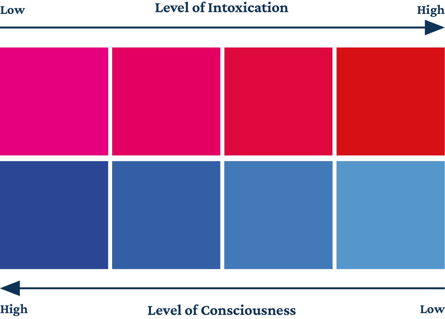
Colour Concept
These are the colours used in the book. The pink colour indicates the level of intoxication, from pink (low intoxication) to saturated red (high intoxication); blue colour indicates the level of consciousness, from dark blue (high consciousness) to pale blue (low consciousness). Each chapter will only apply one of the pairing to indicate the drunkenness throughout the book.
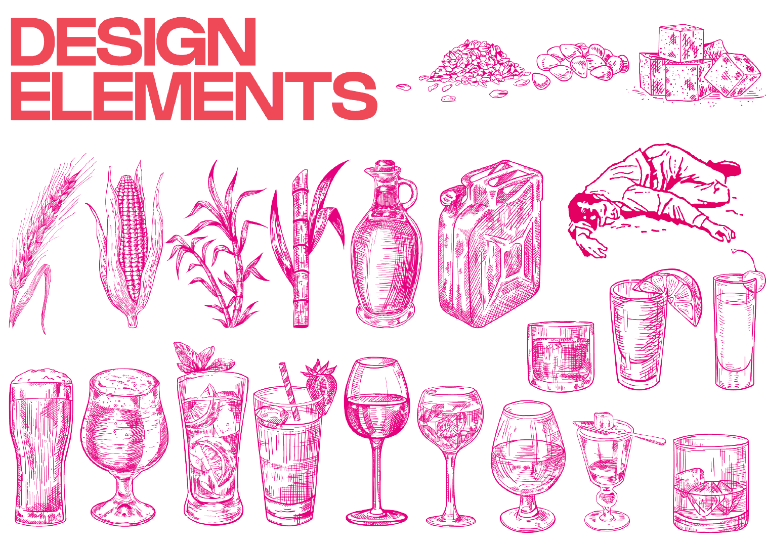
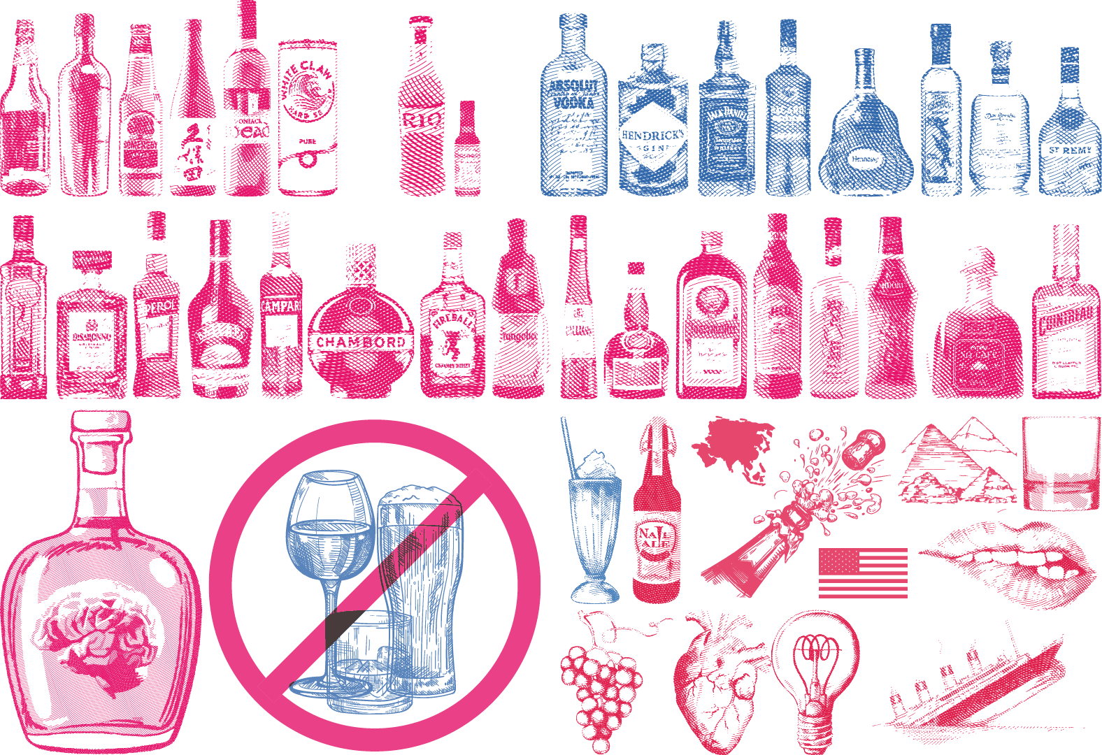
Graphic Elements
Page Layout Ideas
Each breakdown page of the 4 chapters included a brief history of alcohol in a different timeline and the background imagery shows the scene of that particular history. Besides, the typography indicates the effect of intoxication, as the image shown, the first image (top left) has nothing happen to the text compared to the last image (bottom right) which the text has altered to portray the point of view of drunk.
In Chapter 1, the grid and imagery all follows according to the grid system, indication the early stage of drunkenness—Sobriety. The stage where consists low level on intoxicated and still remain clear consciousness. This spread layout is reference from Dari Ngak Ngik Ngok ke Dheg Dheg Plas by Irama Nusantara (Right).
In Chapter 2, the text and imagery starting to blend together, not fully according to the grid system, indication of the second stage of drunkenness—Euphoria. The stage where the intoxication staring to take place while still able to remain consciousness. This spread layout is reference from Housatonic Guidebook 2019 by 17 artists.
In this chapter, the text starting to have its own thought, slightly slanted to different directions, the saturation from the early pink colour has started to turn red. Indication of the third stage of drunkenness — Excitement. The stage where the intoxication increases while bearly remain consciousness. This spread layout is reference from LUNCH by Junki Hong.
In this chapter, the text diffuse into multiple directions, portraying the drunk vision, the pink colour from the early stages has turned into saturated red, indication of the fourth stage of drunkenness — Confusion. The stage where the intoxication level reached it peaks and heavily effecting the consciousness as a result of unconsciousnness or temporary lost some function of senses and remembering. This spread layout is reference to DSCF4775 by Anna Niestroj.
Test Print
Test prints is to ensure the text sizin, layout measurement and colours are done in the ideal way as expected.
Binding Process
1. Trim and Fold
Trim the papers according to the crop mark and fold it half for each spread and arrange it accordingly.
2. Measure and Punch Hole
Measure and punch a few holes at the middle of the papers and sew/bind it all together to create the spine of the book.
3. Apply Adhesive Finishing
After sewing, apply PVA glue to the spine to provide extra support for the spine, it can hold the book together and as a finishing layer.
4. Compress and Dry Out
Apply extra forces to prevent the adhesive leak into the pages, left it few hours till it fully dries out. And the book binding is done.
Mindmap
Although I’m not a “drinking person”, I would like to know more about alcohol, especially in alcoholic beverages as I’m not often drink alcoholic beverages unless gathering with friends, dinner with family on special day or during festival such as celebrating Lunar Chinese New Year and Christmas. I think it might be a potential thing to explore on—especially for a person who does not often consume alcoholic beverages frequently. I initially made a mind-map to gain some insight into all the perspectives I could explore on the subject, then organised the topics as my table of content and then start the research process.
Secondary Research - Research List
1. What is Alcohol
2. Alcohol in Chemistry
3. Classification of Alcohol
4. Type of Alcohol
5. Uses of Alcohol
6. Where alcohol can be found
7. Common sources of alcohol
8. The History of Alcohol
9. Distilled and Undistilled Drinks
10. Beer — Lager and Ales
11. Wine — Tannin, Acidity, Sweet and Dry
12. Types of Wine
13. Cocktail Bitters and Alcopops
14. Type of Liqueurs
15. Safe and Heavy Drinking
16. Moderate and Binge Drinking
17. Side Effects of Alcohol
18. Drunk Stages
19. Disorder Related
20. 175 Alcohol Booze Facts
21. Artist and Alcohol
22. Beer Symbolism
23. Wine Symbolism
24. The Gods of Alcohol
25. Alcohol Consumption in Asia
26. Asia Brew Alcohol
Primary Research : Observation
To know more about the current beer brands selling in Malaysia, I went to the following supermarkets and speedmarts to observe about it. The left image was shot in KK Mart, Bandar Sunway; the top right image was shot in AEON MaxValu Prime, Sunway Velocity mall; the bottom right image was shot in Village Grocer, MyTown. From these observation, I was able to list out the current selling beer brands in Malaysia, which are Tiger, Carlsberg, Heineken, Guinness, Asahi, Skol, Anchor, Angkor, Royal Stout, Connor’s, Jolly Shandy, Anglia, Edelweiss, and Krononbourg 1664 Blanc.
Primary Research : Drink Test
For this experiment, I randomly bought 15 alcholic beverages and 1 non-alcoholic beverage to test it out. During the process, I record the taste, aftertaste, murkiness, my ratings based on it and the description of my ratings. The 16 alcoholic beverages are TIger, Carlsberg, Asahi, Malta (non-alcoholic beverage), Guinness, Royal Stout, Edelweiss, Kronenbourg 1664 Blanc, Somersby, Apple Fox, Merlot (Red Wine), Sauvignon Blanc (White Wine), Soju Blackcurrant & Peach flavor, and Rio Light (Brandy Cocktail) Grape & Peach flavor.
Primary Research : Art Medium
In this experiment, I use the alcoholic beverages that I’ve purchased for the taste test, save some of it and use it as an art medium. Draw something using it and see the effect on paper and will it fade after a long time?
After having fun tasted it on art paper while having a few sips, the light coloured alcoholic beverages doesn’t leave a prominent stain on the paper even after a few layers. It will just leave a slightly yellowish stain on paper. However, for dark coloured alcoholic beverages such as Guinness and Royal Stout, it did leave a very prominent brown colour on the paper. Besides, the artwork has been placed 8 weeks for now and it doesn’t seem to be faded yet.
Book Ideation
The book size was set as an B5 size (250 x 175mm). The binding style of the book is using DIY Kettle Stitch Binding. The reason for chosing this stitching method is to portray the experimental idea and present it as a documentation catalog. Other than that, it is a great opportunity for me to get it hands on for the binding process. The intention of the book is experimental, enjoying the process to compile any findings and experiments into a book and using it to create a discource—express all about alcohol and my idea of it.
Moodboard
Based on the theme moodboard, the design concept of my book will apply duo-tone colour, vintage cross hatch imagery and contemporary brutalism approach. For visualising idea using colours and grid system, as my design concept is using duo-tone, the two colours portray the balance of self-consciousness and intoxication level. Each chapter will show the stages of drunkenness, starting from sobriety, euphoria, excitement to confusion. The indication of intoxication will slowly occur and increases as the pages go on. The balance of both colours will eventually be in a state of chaos to portray the loss of self-consciousness of being drunk.
Book Content Arrangement
The first attempt (Left) of arranging the book content based on the research findings and matching with the stages of drunkenness; the last attempt (Right) of arranging the book content based the page distribution for binding and content rearrangement from the first attempt. Most of the subtopic from the first attempt combine together in this version.
Layout Moodboard
This moodboard is show to ideation of the layout of each chapter as I’ve adapted the ideation of the stages of drunkenness for each chapter.
Page Planning
To ensure I’m able to achieve the binding method that I’ve planned for, I need to plan my pages to be a number that can be divided by 4. I planned my book will have 64 pages including the front and back cover, which means that it will be 32 spreads; 16 papers will be used in my book production.
On the other hand, I also need to plan about separate the spread into signature. This step is important which it will be easy for me to binding it altogether without having any miscommunication when I send it to printing. For the signature, as I’ve 16 papers used for my book production, I planned to have 8 signatures as each signature will have 2 papers folded.
Prototype
The prototype I’ve create using 4 pieces of A4 paper cut equally into 16 small spreads and divided in to 8 signatures which contains 2 small spreads and folded together. This step is to show outcome of the book and the paging arrangements.
Layout Thumbnail
Typeface Selection
To make it more of a documentation and catalog type of approach, I decided to use serif fonts to as the typeface of the book. I initially decided around these three typefaces, Times New Roman, Cambria and Crimson Pro, and later decided to use Crimson Pro as the typeface. This is because the typeface is less formal and sharpness compared to the other two. As I’ve included the drunkenness stages concept to the book, using this typeface will convey the message or content more casual rather than formal.
Colour Concept
These are the colours used in the book. The pink colour indicates the level of intoxication, from pink (low intoxication) to saturated red (high intoxication); blue colour indicates the level of consciousness, from dark blue (high consciousness) to pale blue (low consciousness). Each chapter will only apply one of the pairing to indicate the drunkenness throughout the book.
Graphic Elements
Page Layout Ideas
Each breakdown page of the 4 chapters included a brief history of alcohol in a different timeline and the background imagery shows the scene of that particular history. Besides, the typography indicates the effect of intoxication, as the image shown, the first image (top left) has nothing happen to the text compared to the last image (bottom right) which the text has altered to portray the point of view of drunk.
In Chapter 1, the grid and imagery all follows according to the grid system, indication the early stage of drunkenness—Sobriety. The stage where consists low level on intoxicated and still remain clear consciousness. This spread layout is reference from Dari Ngak Ngik Ngok ke Dheg Dheg Plas by Irama Nusantara (Right).
In Chapter 2, the text and imagery starting to blend together, not fully according to the grid system, indication of the second stage of drunkenness—Euphoria. The stage where the intoxication staring to take place while still able to remain consciousness. This spread layout is reference from Housatonic Guidebook 2019 by 17 artists.
In this chapter, the text starting to have its own thought, slightly slanted to different directions, the saturation from the early pink colour has started to turn red. Indication of the third stage of drunkenness — Excitement. The stage where the intoxication increases while bearly remain consciousness. This spread layout is reference from LUNCH by Junki Hong.
In this chapter, the text diffuse into multiple directions, portraying the drunk vision, the pink colour from the early stages has turned into saturated red, indication of the fourth stage of drunkenness — Confusion. The stage where the intoxication level reached it peaks and heavily effecting the consciousness as a result of unconsciousnness or temporary lost some function of senses and remembering. This spread layout is reference to DSCF4775 by Anna Niestroj.
Test Print
Test prints is to ensure the text sizin, layout measurement and colours are done in the ideal way as expected.
Binding Process
1. Trim and Fold
Trim the papers according to the crop mark and fold it half for each spread and arrange it accordingly.
2. Measure and Punch Hole
Measure and punch a few holes at the middle of the papers and sew/bind it all together to create the spine of the book.
3. Apply Adhesive Finishing
After sewing, apply PVA glue to the spine to provide extra support for the spine, it can hold the book together and as a finishing layer.
4. Compress and Dry Out
Apply extra forces to prevent the adhesive leak into the pages, left it few hours till it fully dries out. And the book binding is done.